As I have discussed previously, the S&P 500 Index is arguably the most widely-followed U.S. stock market index. The S&P 500 Index is a market cap-weighted index of U.S. equities of 500 large companies.
Standard & Poor's introduced its first stock market index in 1923 and created the S&P 500 Index in 1957. Prior to 1957, Standard & Poor's utilized a different index, the S&P 90 Index, that tracked performance of large company stocks. Accordingly, market returns for the S&P 500 Index and it predecessor index are available going back to the 1920s. I have been able to locate a website with such returns dating back to 1926, as shown in the charts below (click on either chart for a larger view).
The YTD total return (including dividends) for the S&P 500 Index is approximately -39.4%. If the S&P 500 Index were to end the year at the same level as it closed on Friday, November 14, 2008, this would constitute the second worst annual return for the S&P 500 Index (or its predecessor index) in the 83 years for which I have data. The only year with a worse performance was 1934, during the midst of the Great Depression, when the index dropped about 43.34%!
The U.S. economy is almost certainly in a recession and it could last several additional quarters, and possibly through the end of 2009. However, the onslaught of another "Great Depression" is hard to imagine, so this might be a good time to consider investing more money back in the market at the current depressed levels.
The charts below list calendar year returns, annualized returns through the end of each calendar year, and annualized returns for 5-, 10-, 15-, 20-, and 25-year periods. As shown, as of today, the annualized return of the S&P 500 Index (and its predecessor index) is about 9.26%, the 5-year annualized return is about -2.92%, the 10-year annualized return is about -1.75%, and 15-year annualized return is about 6.19%, the 20-year annualized return is about 8.22%, and the 25-year annualized return is about 9.61%.
The current 5-year annualized return of -2.92% is the worst it has been since 1941, during World War II, when the annualized 5-year return was about -7.51%. The current 10-year annualized return of about -1.75% is the worst it has ever been based on the data I have back through 1926!
The S&P 500 Index is at extremely low valuations relative to where it has been in recent years. I have a strong feeling that sometime in the future investors are going to look back at the 2008 market and realize that stocks were a screaming "buy." My assessment does not mean that I expect stocks to pop up 40% in a short period of time from where they are now. Instead, it wouldn't surprise me to see the S&P 500 Index drop another 10% from where it is now, as there is quite a bit of fear in the markets at this time and investors have lost confidence in the markets. However, as some point the S&P Index and other U.S. stocks will be much, much higher than they are today, as legendary investor Warren Buffet argued last month.
I have posted an updated chart for the returns of the S&P 500 Index during the period between 1926-2015.
Sunday, November 16, 2008
Friday, November 14, 2008
Some Members of Congress Are Considering Eliminating 401(k) Plans
I was reading the most recent issue of Forbes magazine today (dated November 24, 2008) and saw a blurb by one of the columnists who claimed that some members of Congress are considering legislation that would abolish 401k plans. I assumed that was probably mere hyperbole. However, I did some Internet searching and discovered that it is true!
High ranking democrats in the House of Representatives are exploring the possibility of eliminating $80 billion in "tax breaks" on 401(k) plans. Eliminating such tax breaks would mean that money investing in 401(k) plans would no longer be pre-tax. It's a bit of a misnomer to call these "tax" breaks, in my opinion, seeing as how money invested in 401(k) plans is eventually taxed when it is withdrawn from the plan. Accordingly, money invested in 401(k) plans is merely tax-deferred - it's not as though the money is just never taxed at all.
House Education and Labor Committee Chairman George Miller, D-California, and Rep. Jim McDermott, D-Washington, chairman of the House Ways and Means Committee’s Subcommittee on Income Security and Family Support, are apparently pushing to remove the tax-deferral status of 401(k) plans and would like to implement a new system of guaranteed retirement accounts to which all workers would be required to contribute.
Teresa Ghilarducci, a professor of economic-policy analysis at the New School for Social Research in New York, has drafted a plan that is being considered by Miller and McDermott, among others. Under Ghilarducci's plan, all workers would receive a $600 annual inflation-adjusted subsidy from the U.S. government but would be required to invest 5% of their pay into a guaranteed retirement account administered by the Social Security Administration. The money in turn would be invested in special government bonds that would a pay 3% a year, adjusted for inflation.
I realize that the stock market returns over the past decade have been pathetic, but locking everyone into a plan that only returns 3 percent a year and forcing everyone to invest 5% of their salaries in it is ridiculous! Since 1926, the U.S. stock market has returned an average of close to 10% per year, or around 7% in real terms when accounting for inflation. Forcing a 25 year-old worker, for example, to pay into such a system for the next 40+ years with such low returns seems like a complete waste of financial resources.
This would be a dramatic expansion of the current Social Security system. It is obvious that the current Social Security system has major problems and may at some point in the near future run out of money. Expanding such a pension-type of welfare system would be one of the stupidest things that the morons running Congress could possibly do. I really hope that this plan doesn't get much support in Congress and it it does, I hope that the new president Obama has the wise judgment to reject such a wasteful and expensive plan.
Tuesday, September 23, 2008
New Designs for the 2009 U.S. Penny
In September 2007 I discussed proposed new designs for the 2009 Lincoln cent (a.k.a., the U.S. penny coin). The front side of the Lincoln cent will remain unchanged, continuing to show a profile view of Abraham Lincoln. The obverse side, however, will be changed to commemorate the 200th anniversary of Lincoln's birth. (2009 will also mark the 100th anniversary of the Lincoln cent - the first Lincoln cents were introduced in 1909.) This will mark the second time that the observe has been changed. Between 1909 and 1958, wheat stalks were shown on the observe side and the current design of the Lincoln Memorial has been shown on the obverse side since 1959.
There are going to be four new designs shown on the obverse sides of Lincoln cents in 2009, with a new design being introduced every three months. The first new Lincoln cent is scheduled to be introduced into circulation on February 12, 2009, Lincoln's birthday.
The first design shows a log cabin, representing the cabin in Kentucky where Lincoln was born. The second design depicts a young Lincoln reading a book while taking a break from working as a rail splitter in Indiana. The third design shows Lincoln as a young lawyer standing in front of the former Illinois state capitol building in Springfield, Illinois. The fourth coin depicts the half-completed U.S. Capitol dome, representative of Lincoln's order that construction of the Capitol continue during the Civil War as a symbol that the Union would survive.
Sunday, July 20, 2008
Historical Returns for the S&P 400 Midcap Index
The S&P 400 Midcap Index is the most widely-followed of all U.S. Midcap stock market indices. Midcap stocks are generally defined as those of companies with market capitalizations between $1 billion and $10 billion. ("Market capitalization" refers to the value of outstanding shares of a particular stock.")
I have previously posted about historical returns for large cap stocks, such as the S&P 500, and of small cap stocks, such as the Russell 2000. I have also posted about the long-term outperformance of small cap value stocks over long periods of time. Investors should also consider investing in Midcap stocks, as they tend to outperform large cap stocks over time with less volatility than small cap stocks. The S&P 400 Midcap Index was introduced in June 1991 by Standard & Poors to track the performance of U.S. mid cap stocks.
The table below illustrates the full year annual returns of the S&P 400 Midcap index between 1992 and 2007. As shown, the S&P 400 Midcap Index returned an annualized average of 13.26% between 1992 and 2007. Between 1992 and 2007, the index rose an impressive 633.34%. The chart below also shows five year annualized returns, starting with the fifth full calendar year of the existence of the S&P 400 Midcap Index (i.e., 1996). As shown, the highest annualized five-year return was 23.05% (between 1995 and 1999) and the lowest was 6.41% (between 1998 and 2002).
Any long-term investor should seriously consider investing money in midcap stocks, such as those tracking the S&P 400 Midcap Index (e.g., the Midcap SPDR ETF (symbol: MDY) tracks the S&P 400 Midcap Index).
** I have posted an updated chart for the period between 1992-2022.
Monday, July 14, 2008
TradingDirect Offers The Best Margin Rates For Investors
Last November I wrote a post about how Fidelity offers a low margin rate for wealthy investors. As of today, July 14, 2008, the lowest margin rate provided by Fidelity is 4.00%. An investor would need to maintain a debit balance of at least $500,000 in order to receive this low margin rate.
Although the Fidelity margin rate is quite low, I recently discovered that TradingDirect offers a far lower margin rate. TradingDirect offers a margin rate as low as 2.75% for debite balances of over $1,000,000. Here is a chart showing the TradingDirect margin rates as of today:
Tuesday, June 17, 2008
Website With Interesting Interest Rate Information
I recently discovered an interesting website that lists various key interest rate information. The website is money-rates.com and it lists current national average money market rates, the prime rate, discount rates, broker call rate, U.S. savings bonds rates, and 30- and 15-year mortgage rates. Such interest rate information is highly relevant to any stock market investor, as stocks tend to be relatively more attractive when interest rates are low. Here is a an image from the website that I captured today:
Monday, May 19, 2008
The U.S. House of Representatives Voted to Change the Composition of Penny and Nickel Coins
The U.S. House of Representatives voted on May 8, 2008 to change the composition of penny and nickel coins to less expensive metals. As I have previously discussed, the U.S. Mint currently loses millions of dollars a year on minting costs associated with producing nickel and penny coins. Nickels currently contain 75% copper and 25% nickel and pennies contain about 97.5% zinc and 2.5% copper. Due to the enormous increase in value of commodities, such as nickel, copper, and zinc, over the past few years, the Mint has been losing money by producing these coins and then selling them to banks at face value. A penny currently costs about 1.26 cents to produce and a nickel costs about 7.7 cents to produce.
The U.S. Mint enacted a law making it illegal to melt down pennies and nickels in December 2006 to prevent people from hoarding pennies and nickels and melting them down to profit from the increased value of the metals in such coins. On May 8, 2008, the House of Representatives voted to change the composition of pennies to a copper-plated steel composition and nickel coins to primarily a steel-based coin. The new penny and nickel coins are both projected to cost less than their respective face values, saving the U.S. Mint millions of dollars annually.
The bill still has to make its way through Congress and be approved by the Bush administration. Apparently there are some objections to some of its current provisions, so it is unclear as to when the coin compositions will actually be changed, if at all.
Saturday, March 08, 2008
S&P 500 Dividends (Updated through 2007)
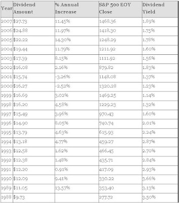
In February 2006 and January 2007 I wrote posts about dividends for the S&P 500 Index. I've decided it is time to update the chart to include dividend information for the full 2007 year. The dividend information is available at the Standard & Poor's website.
The chart shown below (click on the chart to see a larger image) illustrates dividend information for the S&P 500 from 1988-2007. As shown, the dividends paid by the S&P 500 component companies increased from $9.73 in 1988 to $27.73 in 2007. That works out to a total increase of 184.99% and an average annual increase of 5.667% in the dividend yield. This is an impressive annual increase considering that this time period includes the terrible bear market from 2000 to 2002 when the S&P 500 lost about 50% of its value.
As shown in the chart below, the annual % increase of dividends has been increasing very rapidly since 2002. This rapid increase has been fueled both by strong corporate profits over the past few years and the dividend tax cut that Congress passed in 2003. According to Standard & Poor's, the dividends are projected to increase to $30.30 for 2008, a 9.268% increase over 2007, although the 2008 estimate might be not be attainable given the weakening U.S. economic conditions.
I anticipate further % increases in the dividend rate in the coming years. As I mentioned in my 2006 post on S&P 500 dividends, companies are going to continue to be pressured to continue raising dividends due to the combination of favorable tax treatment and the fact that Baby Boomers are nearing retirement age and are going to want extra dividend income and will pressure companies to keep raising dividends. However, if a Democrat wins the November 2008 U.S. Presidential election, I expect the favorable tax treatment of dividends to end and dividend tax rates to rise substantially. Accordingly, the era of rapid % dividend increases may be coming to an end.
***An updated version of this chart containing data from 1977-2016 may be found in this post.
Friday, February 29, 2008
The U.S. Treasury Secretary Would Like to Get Rid of Penny Coins
I have previously written about how I have been collecting U.S. nickel and pre-1982 penny coins because their the value of the metals in such coins (i.e., the "melt value") exceed the face values of those coins. [See my posts from February 2006, April 2006, and October 2006.]
Coinflationis an interesting website that I periodically visit because it gives the melt values of a number of coins currently in circulation, as well as the melt values of silver coins no longer in circulation, but which are fairly widely held by collectors. According to Coinflation, as shown in the image below (click on the image for a larger view) a pre-1982 copper penny has a melt value of about 2.55 cents (i.e., 255% of face value), a copper nickel has a face value of about 7.04% (i.e., 140.8% of face value), and a 1982-2008 zinc penny has a face value of about 0.711 cents (i.e., 71.1% of face value).
Given the rapid rise in the price of commodities such as copper and nickel metals, the U.S. Mint has been losing many millions of by making nickels and pennies. Even though zinc pennies currently have a melt value below their face value, when transportation and other miscellaneous manufacturing costs are taken into account, the Mint loses quite a bit of money making some 7-8 billion pennies each year.
Treasury Secretary Henry Paulson was recently interviewed and stated that he personally would like to get rid of the penny due to its minimal value and usefulness. However, Paulson concluded that it would not be politically doable at this time because the penny coin does have its fans.
Even if the penny coin is not eliminated anytime soon, it seems highly likely that the base metal compositions of nickel and penny coins will likely be changed to less expensive metals at some point in the near future, as I have previously speculated. The Bush administration is currently pushing to give the government the authority to change the metal content of all of the country's coins in order to save money.
If the government does pass legislation to change the metal contents of coins, I expect the Mint to quickly change the base metals of at least the U.S. nickel and penny coinage. If that happens, it is likely that collectors will eventually, over time, snap up much of the older coins currently in circulation. I personally don't want to see the penny coins go away, but I do think that changing the base metal content of U.S. coins would be a good idea so that the U.S. Mint doesn't have to lose money simply by making pennies and nickels.
Wednesday, January 30, 2008
1980 - 2007 Stock Market Returns for Various Indices
Last year, I posted a chart of the annual stock market and bond market returns for various indices for the time period from 1980-2006. The chart I previously posted included returns for small cap indices (Russell 2000, Russell 2000 Value, and Russell 2000 Growth), large cap indices (S&P 500, S&P/Citi 500 Value*, and S&P/Citi 500 Growth*), a broad-based foreign stock index(Morgan Stanley Capital International Index for the developed stock markets of Europe, Australasia, and the Far East ("MSCI EAFE index")), and an index of bonds (Lehman Brothers Aggregate Bond Index ("LB Agg.")). I have updated the chart (click on the image for a larger view) to reflect returns for 2007 and have also added historical returns for the Nasdaq Composite Index.
As shown in the chart below (click on the image for a larger view), all of the indices tracked have provided returns far in excess of inflation (inflation has averaged somewhere between 3 and 4 percent since 1980). The Russell 2000 Value index has outperformed all other investment styles over the time frame, returning 4070%, which is an average annual return of about 14.25%. This is total return is excepially impressive when one considers that Small Cap Value stocks were the worst performers of the tracked indices, losing close to 10% in 2007.
The Russell 2000 Growth Index is the worst performer since 1980, on the other hand, providing a total return of just 1011% over the time period, or about 8.98% per year. Overall formidable return of the Russell 2000 Value index is to be expected, given that Small Cap Value stocks have routinely outperformed other investment styles over long periods of time as I have previously discussed.
International stocks were the strong performers last year, with the MSCI EAFE Index providing the only double-digit returns of all of the indices tracked. The MSCI EAFE Index has now outperformed the S&P 500 Index for 6 consecutive years. This is to be expected, given that the U.S. runs an enormous trade deficit with the rest of the world and the U.S. dollar will inevitably weaken.
* I acquired most of the returns in this chart from old versions of the Callan "Periodic Table" of investment returns. The older charts I found provide data for the S&P/Barra 500 Value Index and the S&P/Barra 500 Value Index, instead of the S&P/Citi 500 Value and Growth Indices, respectively, during the time period from 1980-1986. I'm not sure whether the older S&P/Barra indices are substantially the same as the S&P/Citi indices, but they appear to be so.
** Edit - January 2, 2017 ***
I have updated this chart with results through 2016.
Updated "Periodic Table" of Equity Style Investment Returns Through 2007
Posted below is an updated version of the "Periodic Table" of equity style investment returns from 1988-2007. (Click on the image below to see a larger version of the Periodic Table.) This chart was originally posted on the website for Callan Associates.
*If the image is too difficult to see, you can view a .pdf of the image here.
I have written a new post with results from 1989-2008.
*If the image is too difficult to see, you can view a .pdf of the image here.
I have written a new post with results from 1989-2008.
Tuesday, January 08, 2008
Proshares Offers a Wide Variety of Interesting Leveraged ETFs
ProShares offers a wide variety of interesting Exchange Trade Funds ("ETFs") that may be suitable to some inventors. The investment company applies financial leverage to implement trading strategies that would be prohibitively difficult for most small investors to replicate. The company’s most interesting offerings are its Short ProShares and Ultra ProShares ETFs.
The Short ProShares ETFs track the inverse of certain indices. ProShares offers Short ETFs that track the inverse of indices such as the Nasdaq 100, the Dow Jones Industrial index (i.e., the Dow 30 index), the S&P 500 index, the S&P 400 MidCap index, and the Russell 2000 index. The ProShares ETFs hold financial instruments such as futures contracts, options, and swap agreements to track the inverse of the respective indices.
The Ultra ProShares are designed to return twice the daily performance of the respective indices being tracked. Some of the more popular Ultra ProShares ETFs include ones that track twice the performance of the Nasdaq 100, the Dow 30 index, the S&P 500 index, the S&P 400 MidCap index, and the Russell 2000 index. The Ultra ProShares ETFs also hold a variety of financial instruments in an effort to achieve their intended strategies.
ProShares also offers UltraShort ETFs that track twice the inverse of select indices, such as the Nasdaq 100, the Dow 30 index, the S&P 500 Index, the S&P 400 MidCap Index, and the Russell 2000 index.
The ProShares ETFs are not for the faint of heart, as they are extremely volatile. However, they are suitable for more experienced investors who wish to make plays on movements of certain indices, such as the S&P 500 index.
Although investors can ordinarily sell short ETFs or purchase or sell futures contracts to profit on the fall in price of indices, the ProShares ETFs offer some advantages. For example, a typical investor selling short an ETF would be subject to potential margin calls and potentially unlimited losses in the event that the ETF that was sold short rapidly increases in value. By purchasing a Short ProShares ETF, on the other hand, the same investor would not be subject to margin calls and the potential losses would be limited to the investor's purchase price of the Short ProShares ETF.
I personally like some of the Ultra ProShares ETFs, such as the Ultra MidCap 400 ETF. The long-term annual returns of MidCap stocks are somewhere around 11-12%, and the Ultra MidCap 400 ETF should exceed those returns over time.
It should be appreciated that due to transaction costs (e.g., the cost of purchasing the futures contracts and options, as well as the cost of running and advertising the various ETFs), it is not possible to return exactly the inverse of an index or twice the return of the index. Moreover, the Ultra ProShares ETFs, for example, are designed to return twice the daily return of a tracked index, as opposed to twice the annual return. Accordingly, in flat markets the Ultra ProShares ETFs may substantially trail double the returns of the tracked index over extended periods of time, although the returns are much closer to that of twice the tracked index during volatile markets.
Subscribe to:
Posts (Atom)